
Visualizing How the Internet Breathes
In short:
- The need to visualize network performance data is especially relevant in today’s increasingly large network telemetry datasets.
- Researchers have produced a geographical-like representation of network delay measurement data that is both visually compelling and operationally informative.
- New visualization can serve as inspiration for other researchers and operators.
Humans are inherently visual creatures. As a result, data visualizations are among the most powerful tools network researchers and operators have for clearly and memorably conveying information. The importance of good visualizations is especially relevant with today’s increasingly large network telemetry data sets.
A survey of networking papers reveals a strong presence of traditional visualizations, such as line graphs, histograms, bar charts, and scatter plots. In this post, we present an argument for creative, nonstandard approaches to data visualization, especially for spatiotemporal and other types of multidimensional network data. In particular, we will discuss a problem that traditional visualizations cannot address: how to show a network “breathes” over time.
Network Latency Measurements as Time Series
One set of quantities commonly gathered by network operators is the pairwise round-trip times (RTTs) between routers, usually measured at regular intervals and represented as individual time series, one per router pair. Anomalies in these time series can reveal inefficient routing, extreme traffic conditions, link outages, and more. We refer to this as the time series representation of network delay measurement data.
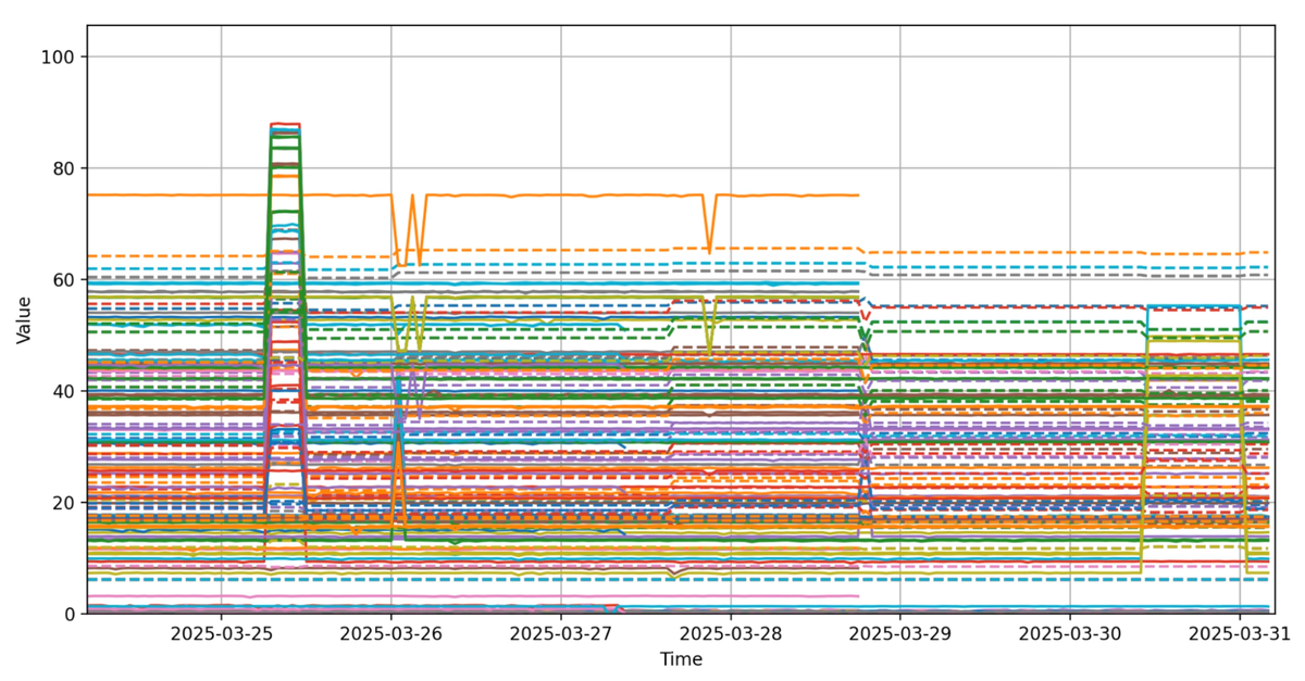
This time series representation (Figure 1), comprised of a set of standard line plots, has a number of drawbacks:
- Even for modestly sized networks, there are too many measurements to easily identify which line corresponds to which pair of routers.
- Although some anomalies may be obvious in the graph, it is hard to tell the geographic context of the events. For example, is the event at the beginning of Figure 1 localized, or does it affect the entire network all at once?
- It is very difficult to tell the severity of any given anomaly. In Figure 1, numerous changes in RTTs are evident; however, it is challenging to determine which are severe enough to warrant operator intervention.
Our goal is to produce a representation of this network delay measurement data that is both visually more compelling and operationally more informative.
A Creative Alternative
Our solution is to represent a snapshot of the network delay measurement data at time t as a surface (manifold), much like a topographical map. We call this surface the network delay space at time t.
Intuitively, the measured RTT at time t between two routers corresponds to the shortest (geodesic) distance between them on the surface. In effect, walking on the surface along such a geodesic as if it were the Earth defines a path whose length approximates the measured latency.
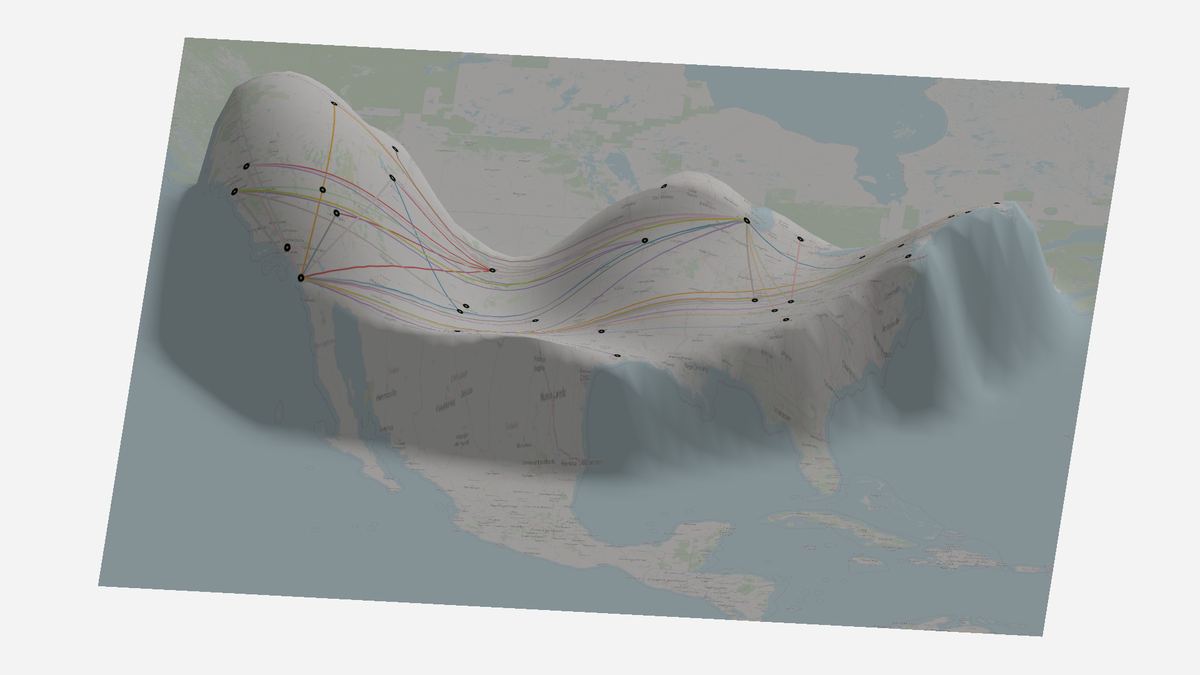
As we generate and consider different snapshots over time, we can smoothly interpolate between surfaces at each snapshot to create a cohesive animation that shows how the network delay space evolves; that is, a visualization of how the network breathes.
Our approach to transform a time series representation of network delay measurement data into a breathing network delay space leverages tools and techniques from Riemannian Geometry and is described in more detail in our HotNets paper.
A Breathing Example
To demonstrate the utility of our visualization method, we apply it to publicly available data provided by ESnet, a DoE-funded high-performance, unclassified network built to support scientific research. We use 56 routers and more than 100,000 measurements to create the animation. The final animation is shown below:
To draw the viewer’s attention, large changes to the manifold are highlighted in red. Furthermore, the shortest (geodesic) paths are drawn between several endpoints.
There are several notable events in the animation. At time 0:12, a large shift occurs in the Utah/Colorado area. As a result, the geodesics passing through that area are pushed south. This corresponds to the first spike in the time series in Figure 1. With the animation, we now have the geographic context that the latency increases were due to an anomaly near the Four Corners region, not a wide-scale outage.
In contrast, at time 1:15, a minor shift occurs in Arizona, leading to the final spike in the time series shown in Fig. 1. We conclude that the latter event is more local and less significant than the time series suggests.
Finally, we observe that the network does not “hyperventilate,” but instead remains stable throughout much of the measured period. This suggests that ESnet provides consistent performance, and deviations from that consistency are relatively minor.
Using the power of non-standard animation, we have created a visualization that offers a deeper understanding of a network’s delay space than could be achieved with more traditional methods. We believe that recent, increasingly large datasets necessitate the adoption of creative visualization techniques, and we hope this work serves as inspiration for other researchers and operators.
Stephen Jasina is a PhD student at the University of Wisconsin-Madison under the supervision of Prof. Paul Barford. His primary interests are Internet measurement and data visualization, though he has a soft spot for abstract math.
The views expressed by the authors of this blog are their own and do not necessarily reflect the views of the Internet Society.