Seeing the Unseen Internet: Lessons from the Internet Visualization Exhibition
The Internet is everywhere. We rely on it for nearly every aspect of modern life—communication, commerce, education, and entertainment—yet few people can describe what it looks like. Measurement researchers have built extraordinary systems to study behavior, performance, and topology, but those efforts often remain hidden behind command-line tools, dense plots, and complex papers.
As organizers for the inaugural Internet Visualization Exhibition (IVE) at ACM SIGCOMM, my colleague, Professor Paul Bardford (University of Wisconsin — Madison), and I sought to recognize and celebrate innovative visualizations of Internet data, and to inspire new approaches to visualizing Internet-scale systems and data.
Origin Story
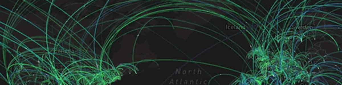
Much of Paul's and my own research has focused on recovering the Internet’s geometry—how its physical layout shapes the flow of data. As large cloud providers like Google, Azure, and AWS have grown, they’ve also made their internal networks increasingly opaque, blocking the traceroutes researchers once relied on to study connectivity. Our manifold project began as a response to this loss of visibility. We asked whether it was still possible to see the details of the “shape” of the Internet by using simple round-trip time measurements.
Embedding latency into geometric space revealed that the Internet still carries the imprint of geography: some regions appear tightly curved and interconnected, others stretched thin by detours or congestion. By visualizing the resulting surface, we can start to see the network again: clusters that mirror geography and distortions that reveal suboptimal routing. Over the years, we generated hundreds of such figures, never intending them as art, yet they often caught people’s attention in ways simple descriptions did not. They prompted questions that data alone rarely evokes: why does this region warp? What explains that missing area? Those moments underscored how visualization can expose structure and provoke curiosity.
19 Submissions That Explained, Revealed, and Provoked
When we began organizing the exhibition, we decided to be deliberately broad in what we accepted as a “visualization.” Our goal was to expand the possibilities of how the Internet could be represented.
We sought to incorporate contributions that were both captivating and informative, whether they originated from data visualization, topology research, or digital art. A good visualization, we argued, is one that makes people think differently about the system it represents.
We received 19 submissions spanning nearly every scale and layer of the Internet: from satellites in orbit to antennas in rural Senegal, from traceroutes beneath the ocean to DNS events flying across the globe. Some came from research labs in CS or geography, others from operators or independent creators. Each reflected a different intuition about what it means to see the network.
What struck us most was the diversity of goals. Some visuals were designed to make complex measurements intuitive and navigable. Others sought to reveal hidden structure or dynamics in raw data. And a few aimed to provoke conceptual questions about visibility, infrastructure, and inequality.
As part of this write-up, we are sharing a short video presented at the non-paper session (see below) to capture the range and creativity of the exhibition. Please contact the authors if you have any questions regarding their visuals.
What’s Next
The IVE will not be a one-off event. Our next goal is to organize a workshop—potentially at IMC or SIGCOMM—to bring together researchers, operators, and hopefully visualization experts to make Internet data more interpretable and to develop shared methods for visual analysis.
In parallel, we’re creating an online gallery to document these works, the tools behind them, and the ideas they surface.
Our long-term vision is to build a sustained collaboration between the Internet measurement and visualization communities.
Email us if you wish to be involved in our future endeavors or have feedback on our recent event.
Finally, we would like to acknowledge and thank every single contributor who made IVE possible and the Internet Society for sponsoring the prize:
Alexander Männel (TU Dresden); Alagappan Ramanathan (University of California, Irvine); Antonin Rosa-Martin (GEODE, Paris 8 University); Charlotte Escorne (GEODE, Paris 8 University, IFG Lab); Chris Misa (University of Oregon); David Belson (Cloudflare); Frank (František) Borsik (LibreQoS); IODA Team — Angela Meng and collaborators (Georgia Tech); John Todd (Quad9); Louis Petiniaud and Guilhem Marotte (GEODE, Paris 8 University); Romain Fontugne (IIJ Research Laboratory); Roy Leung (BGPTrace.com); Stephen Jasina (University of Wisconsin–Madison); Stephen Suess (RIPE NCC); Steve Song (Internet Society); Thomas Buck (Brighton Analytics); Vartika Shekhar, Sarah Tanveer, Olivia D’Souza, Ali Abedi, and Suman Banerjee (University of Wisconsin–Madison).
Loqman Salamatian is a PhD candidate at Columbia University, researching Internet measurement, model analysis, and Riemannian geometry, with the aim of developing models that bridge virtual and geographical spaces.
The views expressed by the authors of this blog are their own and do not necessarily reflect the views of the Internet Society.
Screenshot of the Fair Internet Report's Global Speed Test Map visualization.